Archaeology usually involves mud, brushes and somebody becoming very excited about a piece of pottery.
My version recently involved the Wayback Machine and websites built in the days when most of us still thought a mobile phone was primarily for making telephone calls.
I founded Total Results in 2005 and have been designing websites around Consett and the North East ever since. Looking back through some of the area's older sites, however, quickly reminded me that plenty of local organisations had already ventured onto the internet before I arrived.
And some of them were there surprisingly early.
It is tempting to look at those old websites now and laugh at tiled backgrounds, tiny photographs and blue underlined links. That would be a little unfair. In the late 1990s there were no smartphones, broadband was far from universal and many businesses were still wondering whether they needed a website at all.
Simply being online could make you look rather advanced.
Thomas Swan - online in 1997
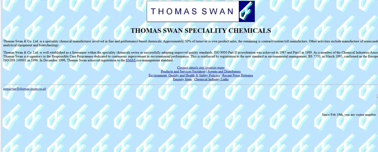
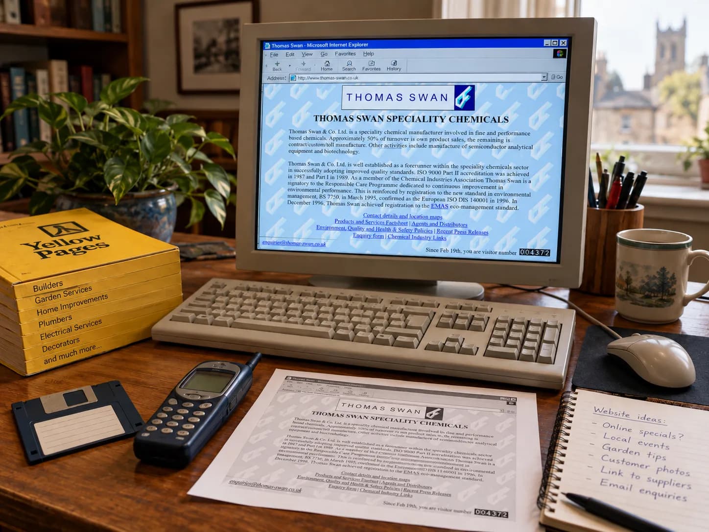
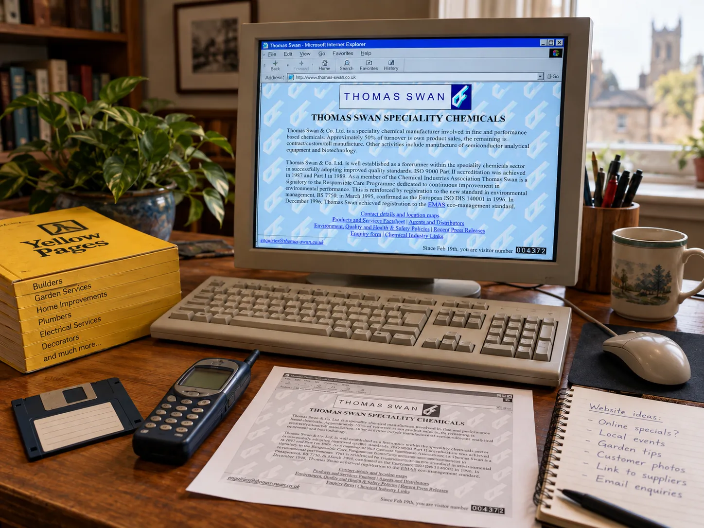
One of the earliest local examples I found belongs to Thomas Swan.
Its 1997 website is almost a museum exhibit of early commercial web design. The background is repeatedly tiled with the company logo, the text runs across a pale blue page and navigation consists largely of familiar blue underlined links.
There is even that great institution of the early internet: the visitor counter.
“Since Feb 19th, you are visitor number…”
Sadly, the surviving version doesn't appear to tell us which number we were. Somewhere, perhaps, visitor 1,000 is still waiting for recognition.
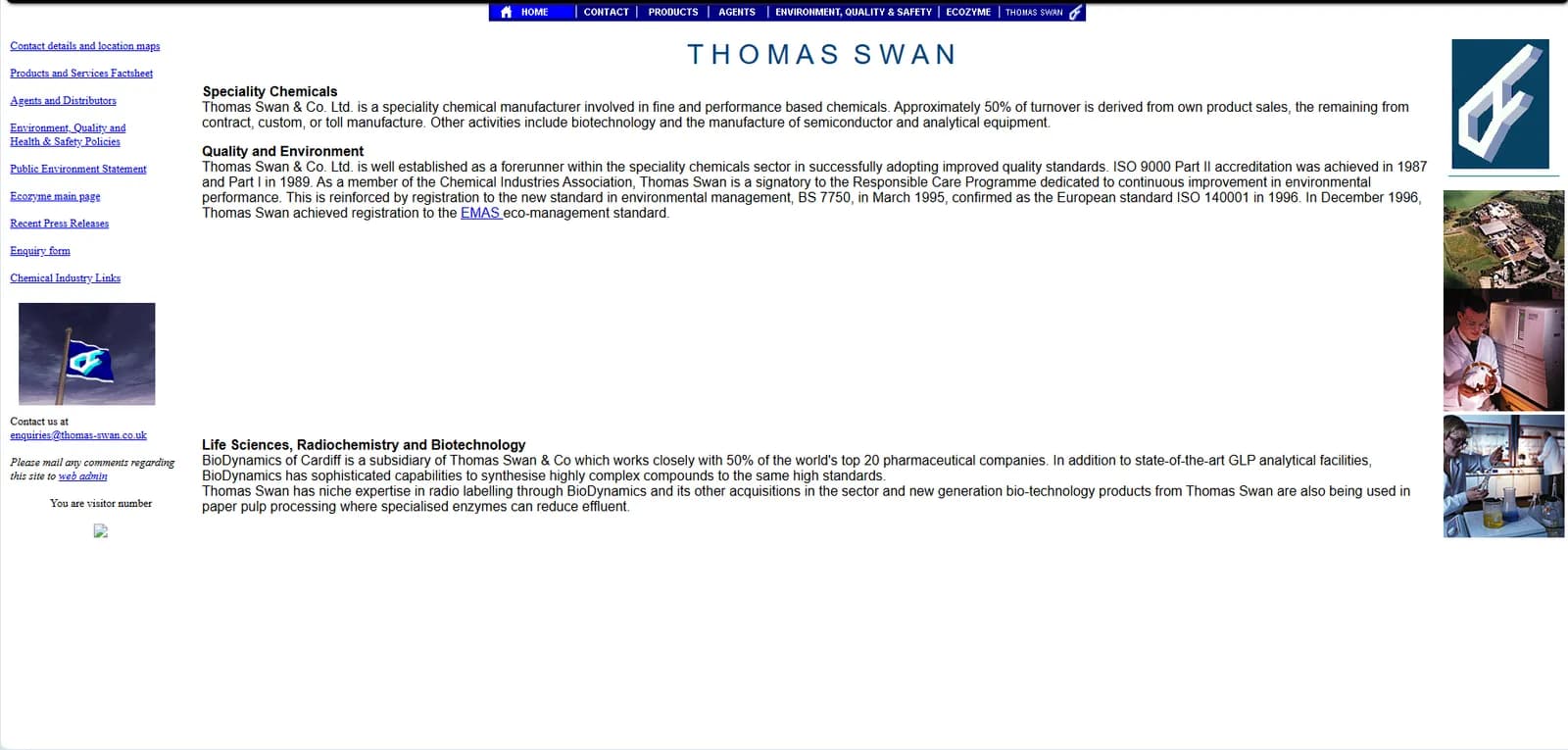
A version from only a year later already looks noticeably more organised. There is proper navigation across the top, a menu down the side, photographs and a clearer structure. You could even contact the “web admin”.
Jump forward to 2026 and the difference is enormous. Large photography, restrained navigation, prominent calls to action and a site designed around what prospective customers actually want to do.
It is easy to regard the 1997 version as primitive from the comfort of today's technology. The more interesting point is that Thomas Swan was online at all.
Derwentside College - when information was enough
Derwentside College provides another excellent snapshot of how quickly the web developed.
Its 1997 homepage looks almost apologetic about being there. There are a handful of links, a photograph, a very large “Sign In” button and enough white space to park a bus.
There is even a broken image.
Some traditions, apparently, began early.
By 2000, however, the college had a much more substantial website. A proper logo had appeared, photographs were integrated into the content and the site explained courses, facilities and the college itself in considerably more detail.
The contrast with today's Derwentside College website is striking. Now the emphasis is on bold imagery, course discovery, apprenticeships, school leavers and prominent calls to action.
That illustrates one of the biggest changes in web design.
Early websites often asked:
What information can we put online?
Modern websites are much more likely to ask:
What do we want the visitor to do next?
That sounds obvious now. It wasn't always.
Consett AFC - guestbooks, league tables and plenty of red
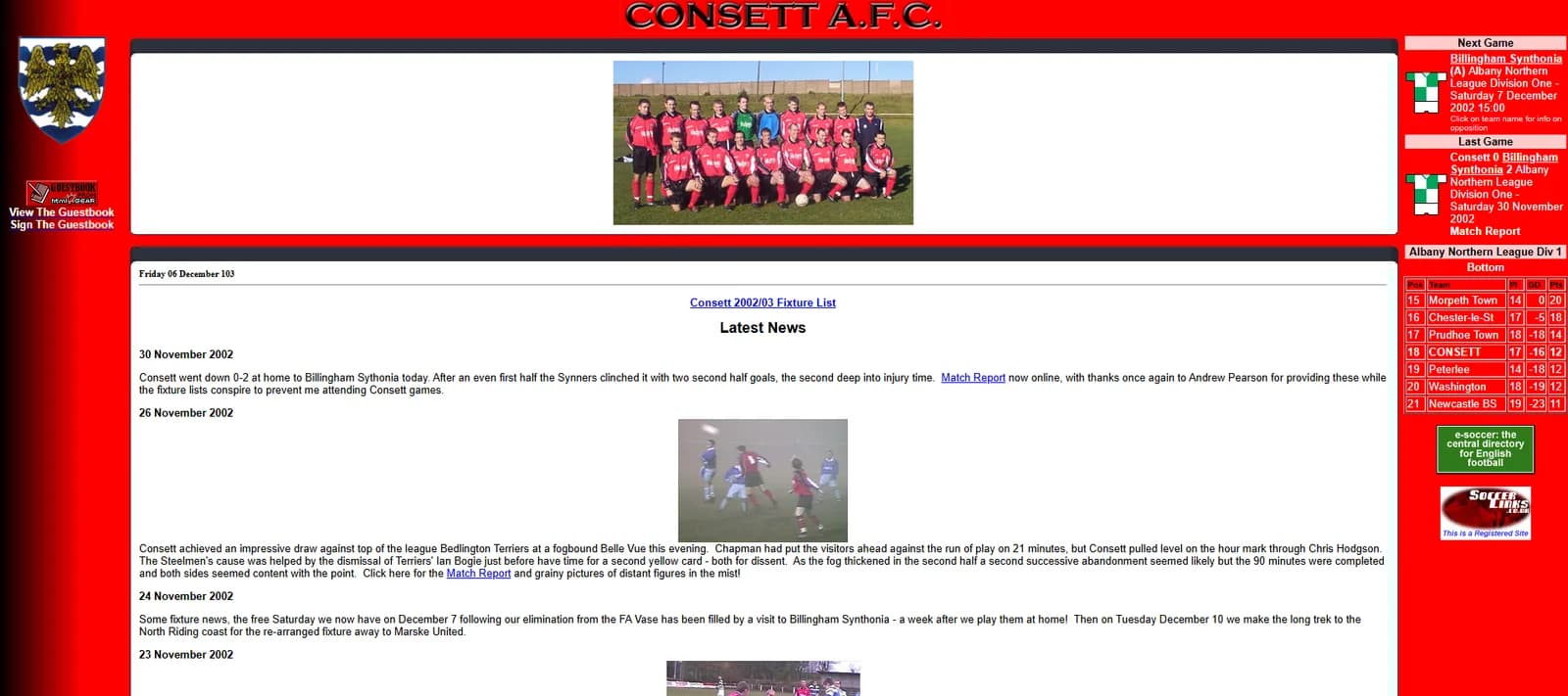
Consett AFC was online by 2002, and nobody looking at the archived homepage is likely to mistake it for 2026.
The bright red background is difficult to overlook. So are the league table, fixtures, results, match reports and photographs, all competing enthusiastically for attention.
And there is another old friend:
“View The Guestbook”
followed, naturally enough, by:
“Sign The Guestbook.”
Guestbooks were once almost compulsory. Apparently the internet wasn't complete until strangers had somewhere to write “Great site!” underneath it.
Again, though, the important point is not how dated the design appears. For supporters this was genuinely useful. Fixtures, league positions and match reports could be accessed without waiting for the newspaper or the next programme.
The current Consett AFC website still provides broadly the same information. The difference is that modern design allows it to be presented far more clearly, with better photography and less risk of temporary snow blindness from the background.
Technology changed dramatically.
What supporters wanted to know didn't.
Anvil Homes - please adjust your monitor
By 2004 websites were becoming more sophisticated, although Anvil Homes provides one particularly good reminder of how different the technical world still was.
At the bottom of its homepage appeared the helpful instruction:
“Optimised for V4+ Microsoft/Netscape browsers at 800x600 resolution.”
Younger readers may need to accept my assurance that this was once considered useful information rather than a cry for help.
The rest of the site is equally characteristic of its period: fixed dimensions, small photographs, carefully arranged panels and plenty of explanatory information.
By 2008 it had already become cleaner and more photographic.
The current site goes much further. Large aerial imagery dominates the screen, navigation is restrained and the emphasis is firmly on creating an impression of the development rather than explaining everything immediately.
You could summarise the progression fairly neatly:
2004 - tell visitors everything.
2008 - organise it better.
2026 - show them a large photograph and trust them to explore.
And yes, mine changed too
It would be convenient to point at everybody else's old websites and quietly forget my own.
Unfortunately, the internet has a better memory than I do.
The earliest surviving Total Results homepage I can find is from 2007. It contains many of the usual ingredients of the period: lots of text, blue links, small boxes and an admirable determination to explain almost everything before the visitor had a chance to escape.
Over the years my own site became cleaner, more visual and increasingly focused on what I actually wanted visitors to do.
Which is probably the real lesson from all these archived pages.
The fashions have changed enormously. Technology has changed beyond recognition. We no longer tell visitors which browser they should use, visitor counters have mercifully disappeared and guestbooks have largely gone the same way as dial-up internet.
But the fundamental purpose of a business website hasn't changed very much at all.
It still needs to explain what you do, give people confidence in you and make it easy for them to take the next step.
We've just spent the past 30 years discovering rather better ways of doing it.
And I have the old screenshots to prove that some of us needed the practice.